
Here are some graphics I've made using R.
I first became interested in using data science from my Data Science Across Diciplines course in Geography. Since then I have worked as Research assistant doing data science in R. I cannot show the raw data because of privacy reasons.
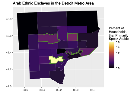
Ethnic Enclaves and Success for Arab Immigration to the
Detroit Metro Area
This research paper was created as part of my Senior Geography Seminar. Using census data, I used analysis on a linear regression to determine the effects that the Detroit Metro Area's Arab ethnic enclaves have on on Arab immigrant household heads in the United States.

2020 RUG Chord Diagram
This is a chord diagram I created over the summer showing the total flows of people migrating between counites across the rural-urban gradient in 2020. This was part of a research position studying migration patterns in the US before, during, and after the pandemic. Made with R.
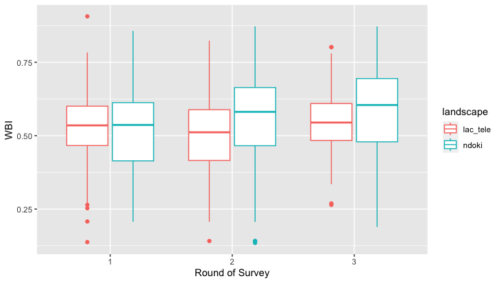
Ndoki and Lac Tele WBI
This graph I created in my data science class shows the average Well Being Index between villages surrounding two different protected areas in the Republic of the Congo. The WBI calculates a number based off of how much a village has compared to what they surveyed as necessary. Made with R and ggplot.